Wednesday, 26 November 2014
Monday, 24 November 2014
Main Task: Photos Taken
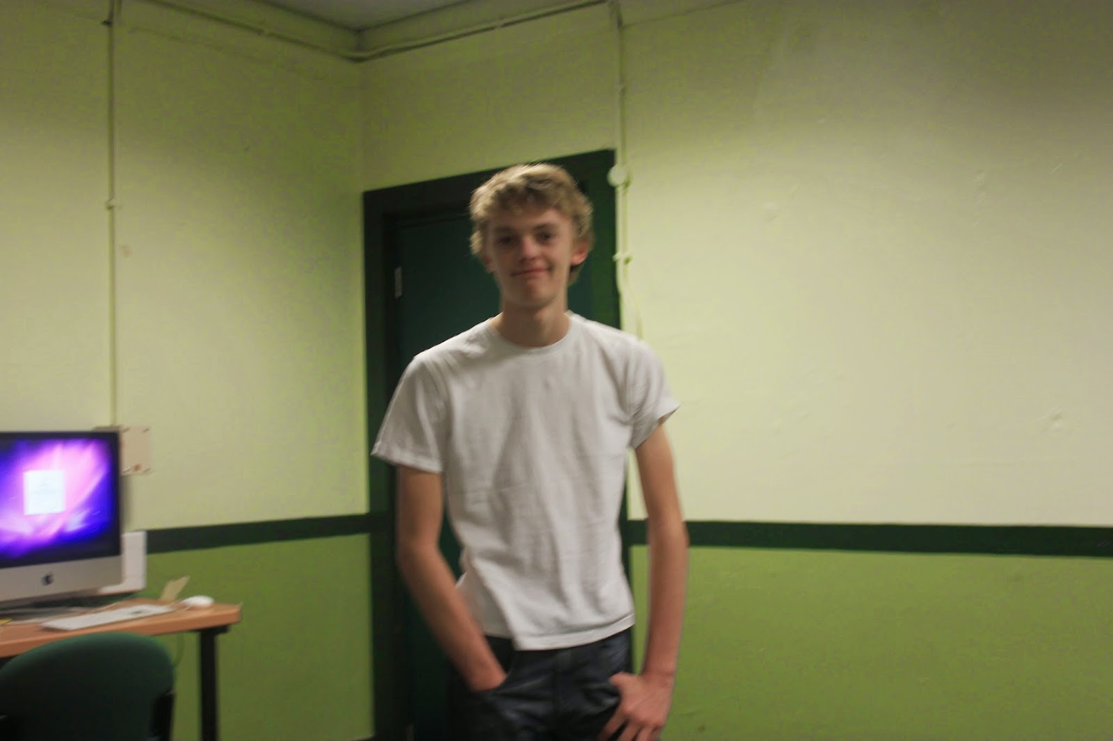
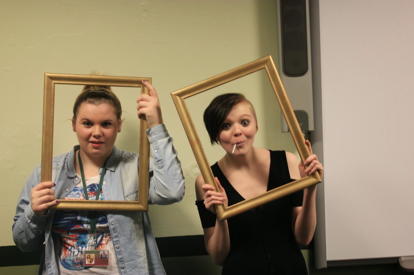
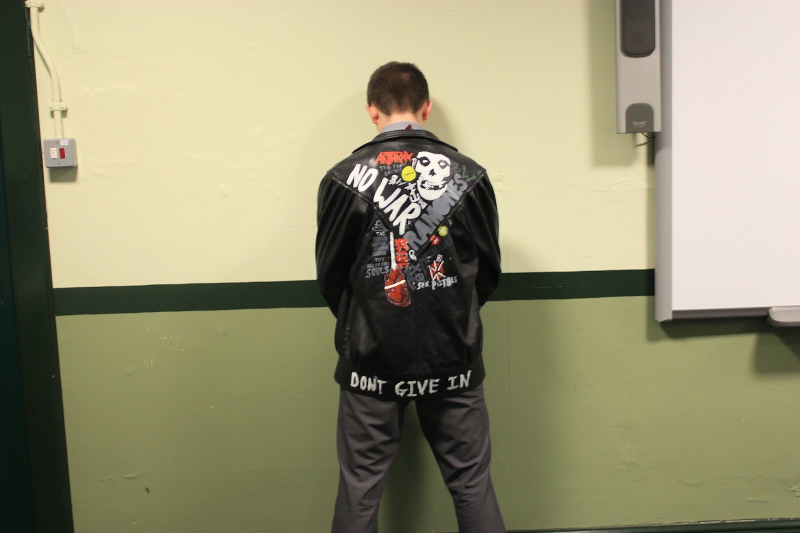
These are the photos I took.
I took quite a few pictures of Leon facing the wall for my contents page or my double page spread. I wanted a close up of the jacket as well as a stance that clearly read 'back off' or looked as though he was urinating against the wall which would be seen as disgusting and uncaring therefore fitting in with my double page piece.
For my front cover, I got a shot of everybody leaning against the wall. the two enlarged pictures are the ones I may use. The blurry one is preferable as it will look mysterious on the front cover, and it defies the norm as most conventional front covers. The second may also be used, but I would prefer to use it in my contents page.
Main Task: Photo Taking Problems
Problems:
Ross wasn't able to make it
-Aaron (went to) stand in his place
The jacket didn't fit Aaron
-Leon stood in, and it turned out that the jacket was caught on a badge
The weather was terrible
-The pictures were taken inside against a blank background to later be edited
Allan didn't have a blank t-shirt
-I brought in a t-shirt
Eventually, all of these problems got resolved through one way or another and photos were taken as planned.
Monday, 10 November 2014
Main Task: Photo Planning
To get my front cover image I will need to consider the costume, makeup and setting as I will not need props.
Makeup-
Harry: Eyeliner / Spray-in hair dye streak
Allan: Spray-in hair dye streak and spiked
Jade: Hair straight / Spray-in hair dye fringe to continue to / eyeliner streak
Ross: Hair spiked up / eyeliner
Costume-
Harry: T-shirt (grey/white) / Blue jeans with turn ups
Allan: T-shirt (white-black) / Black jeans
Jade: White T-shirt / Black tank-top / Black skinny jeans
Ross: T-shirt (black-grey) / Sherlock coat / Skinny jeans
Setting: Blank brick wall-
Harry: Front / Far left
Allan: Back / left
Jade: Back / Far right
Ross: Front / right
Date for photos: Friday 21st November
Main Task: Contents Page Mock Up
My contents page carries on the house style of the front cover and is set in a similar styling as it keeps the target audience the same.
 |
| The Contents Page |
There are going to be minimal images on the page (at most three including the picture for the welcome box, but not including the logo in the top right corner) to let the contents sprawl across the page and seem to take over. This shows that the content is more important than the images, and it connotes that there is a lot of content as it take sup the whole page. The style and colours follow the same pattern as the front cover, to stand out and contrast and have the same connotations. The main article is in bright yellow to link it to the front cover.
Wednesday, 5 November 2014
Main Task: Front Cover Mock Up
These are the first mock ups of my front cover. My magazine will be based on 'Viva Le Rock' as a style model, and the target audience will be all genders of an age range of about 16-21 years of age.
| Style Model - Front Cover |
Subscribe to:
Comments (Atom)


