Tuesday, 9 December 2014

Main Task: Contents Page - Text

All of the text on the contents page is in Pepertua Tiling except the main title which is in Engravers, and the small text in the grey box which is Perpetua.

 For the title of my page, I used Engravers for my text with a stroke outline and white text. This text is also the largest on the page so it draws attention to itself. It is also the only text with an outline.

The second largest text is the list of content. I used Perpetua Tiling for this as it was a wider version of Engravers. From there, I used both white and red, the red being used to highlight the corresponding articles to the pictures below. The text spreads across the width of the page to fill in the space while also being slightly subtle as it blends into the background slightly.

I used the same font for the captions of the images below the list.

The last bit of text on the page is within the grey box. This is to draw separate attention to it as the box puts it into it's own section which makes it seem important. As well as that, it stands out more. the text itself is a simple introduction to the magazine, and is paired with a picture as to give it an editorial aspect.

Monday, 8 December 2014

Main Task: Contents Page - Images

To link my contents page to my front cover, I used the same colours and themes. This meant that I had to use similar images.

For my background image, I found one that was a stylised version of my front cover basically. IT followed the same style with the distant view point, and the walls framing the page. However, this time it looks as though it's been painted and is not a photograph. From there I put a filter onto it, bringing out the reds of the image.
The Image

For the first of my four images, I used one from the few I took.
The Original Image
And then, I cropped it down and put a black and white filter onto it before adding the stroke effect to give it a slight boarder so it stood out against the background as the black and white effect seemed to blend it in.
The Final Image.
For my next image, I used a picture of Joan Jett to represent one of my articles. I chose the one of her with her middle fingers up to contribute to the unwelcoming theme of the magazine.
The Original Image
I then cropped it and put a stroke effect onto it.
The Final Image.
My third image is a picture of Frank Iero to correspond with another article. 
The Original Image
Again, I cropped it down and put a stroke effect onto it so it would fit neatly onto the page.
The Final Image.
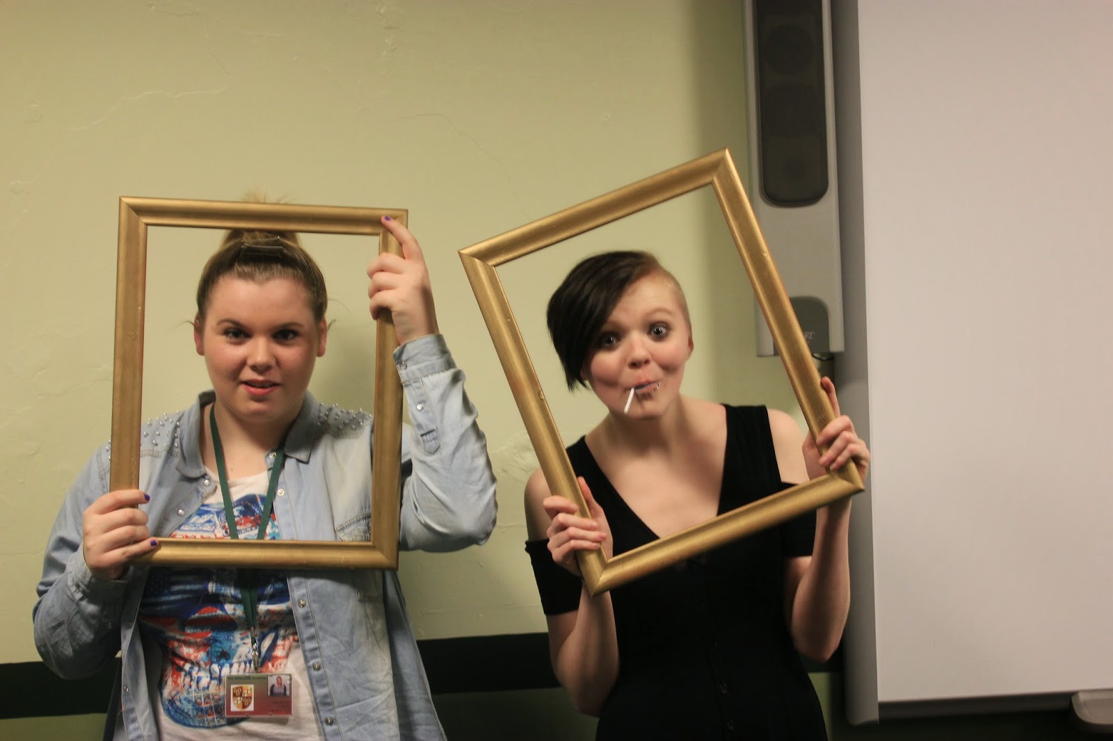
The last image on my page is one taken with the computers camera to give it a 'self made' effect. The image involves the 'editor' and the 'bass player' of JELLYFISH CULT. 
The Image
This was to give the magazine a slightly more casual feel as both the people are pulling stupid faces and look as though they don't really take themselves seriously. Despite the other connotations of the magazines uncaring and flippant attitude.


Main Task: Contents Page

My Contents Page

Friday, 5 December 2014

Main Task: Front Cover - Text

For the text on my front cover, I used a variation of Plantagent Cherokee, Perpetua, and Perpetua Tiling in different sizes and colours. I used these fonts as they blended well together, while also creating a no-nonsense attitude to my magazine as the font stands out, is bold and is demanding. It dominates the page of the magazine which defies the usual conventions as it's normally the images that create the most attention.

Most of the text has a stroke effect which gives the text a bold outline. For the most part the outline was black to make it stand out against the dark background of the magazine, but in one instance it was white.


This was to create a contrast within the same sub-headline


Other times I used a black outline against coloured text, again to make it bold and stand out. The colours also were used to stand out. With the above, it was to fit with the band logo, and with 'Jellyfish Cult' it was to give attention to the band as it was the only text in red.


Thursday, 4 December 2014

Main Task: Front Cover - Images

After deciding on the style model for my magazine, and taking the appropriate pictures for my magazine, I started to create the front cover for it.

The Original Image
For my main image, I chose the image above after taking a few different shots. I chose this due to it's blurry nature. From there, I cropped it down and resized it, and removed the background before putting a black and white filter onto it. From there I blurred it slightly and took the opacity down.
The Final Image.
For my background, I searched for an alleyway on images and found this.
The Original Image
From there, I cropped it down to fit the page and put a black and white filter onto it.
The Final Image.
For one of the secondary images on the page, I chose the Misfits skull as it fit into the supposed articles that I wanted in my magazine.
The Original Image
From there, I removed the background, resized the image to make it smaller on the page and but a drop shadow and bevel onto it to make it stand out against the eventual dark background of the page and give it depth.
The Final Image.
For my second secondary image, to continue with the same sub-headline, I had to find the logo to go with the misfits skull.
The Original Image
From there, I removed the background and resized the image before putting a drop shadow onto it.
The Final Image. 
Again for my third secondary image, to make up a headline of it's own I cropped down a photo of a cd to use the back name and logo.
The Original Image
Again, I cropped down the image before removing the background and resizing it while adding a drop shadow.
The Final Image.
I did this again to the logo, and got a similar result.
The Final Image.
The fourth and last of my secondary images was of Joan Jett and the Black Hearts.
The Original Image
From there, I cropped down the image, removed the background and resized it before putting a black and white filter onto it, while also putting in a drop shadow to give it depth.
The Final Image.
The last image was of a barcode. And to give it the look of being on a magazine I put a price, date and issue number onto it.
The Final Image.

All The Images Together


Main Task: Front Cover

My Front Cover

Wednesday, 26 November 2014

Monday, 24 November 2014

Main Task: Photos Taken

These are the photos I took.


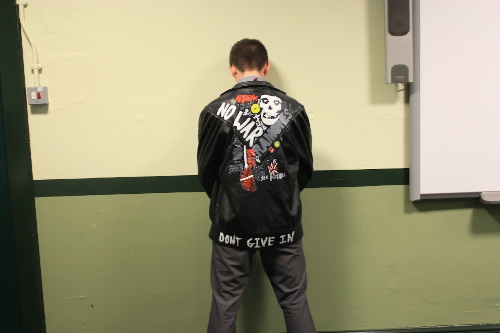
I took quite a few pictures of Leon facing the wall for my contents page or my double page spread. I wanted a close up of the jacket as well as a stance that clearly read 'back off' or looked as though he was urinating against the wall which would be seen as disgusting and uncaring therefore fitting in with my double page piece. 


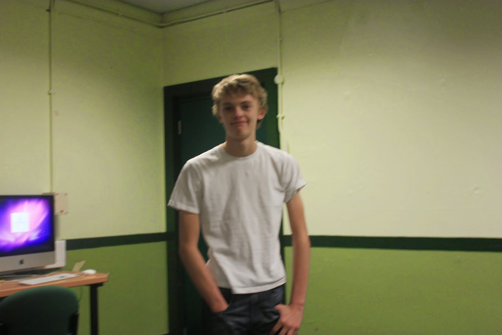
For my front cover, I got a shot of everybody leaning against the wall. the two enlarged pictures are the ones I may use. The blurry one is preferable as it will look mysterious on the front cover, and it defies the norm as most conventional front covers. The second may also be used, but I would prefer to use it in my contents page.