Monday, 20 October 2014

Main Task: Location Test One

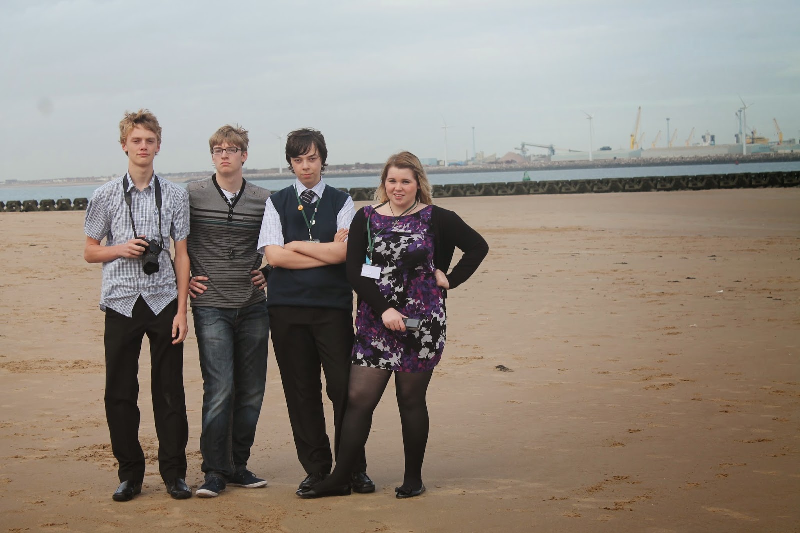
We went to New Brighton beach to try and get some location shots for my magazine front cover.


Jellyfish Cult, the image I will probably use for my double page spread.


An Image I might re-create for my cover.


Another Image I will probably use for my double page spread.

Out of these, I got ideas, playing around with perception and ideas for extra images for the double page spread.

Monday, 6 October 2014

Pre-liminary Task: Final Product

These were the final products of the pre-liminary task to create a school magazine front cover and contents page.

My Front Page
My contents Page

Pre-liminary Task: Contents Page

For my contents page, I based it on many other style models to find a simple style. From there I had to edit an image and then create the contents page.

To get an image for my contents page, I took the 'out-take' pictures from when I was getting images for the magazine front cover. I chose these pictures due to the 'article' context.

The second step was to add the image to the page along with the heading of 'Contents'. I chose the styling of the text to carry on the house style of the front cover.


The last step was adding the contents. I framed the picture with the text, getting the main article to shift so it highlighted the image to go with it.

Wednesday, 1 October 2014

Pre-liminary Task: Front Cover

For my front cover, I used the style model to base the image and set up from. From there I took a few steps to get my final product.
My first step was editing my picture and then placing it on the white background. I placed it central, so that the eye line would coincide with the rule of thirds.


My second was to add the masthead, choosing one that wasn't very serious. I chose the colour black to make it stand out against the white background. And put it behind the image to give the image depth.


The third was to add the main headline, making it the second largest text to make it stand out and draw the readers attention to the main article.

The final step was to add the sub headlines, making them smaller and spreading them out to give more information about the magazine. I used white on the text to make it visible against the background and give it contrast to the masthead.